Design Patterns
A design pattern is an abstract solution to a common problem. In their famous urban planning text, A Pattern Language, Christopher Alexander, Sara Ishikawa and Murray Silverstein (1977) wrote that a design pattern “describes a problem which occurs over and over again in our environment, and then describes the core of the solution to that problem, in such a way that you can use this solution a million times over, without ever doing the same thing twice” (p. 10). A dropdown list is an example of a design pattern in interface design.
According to William Brown, Raphael Malveau, Hays McCormick III & Thomas Mowbray (1998): “a design pattern becomes an AntiPattern when it causes more problems than it solves” (p. 2). Antipatterns “may be the result of a manager or developer not knowing any better, not having sufficient knowledge or experience in solving a particular type of problem, or having applied a perfectly good pattern in the wrong context” (p.6). For example, if the dropdown list only holds one item (instead of several), it’s an antipattern; it requires more effort from users than it saves.
When Brignull (2013) defined a dark pattern as “a user interface carefully crafted to trick users,” he conflated two things we ought tease apart. Dark patterns are not, strictly speaking, the interfaces themselves. We should say that deceptive interfaces are composed according to dark patterns; they are not the patterns themselves.
Scholarly discourse in journals dedicated to, variously, the design of interactive systems, to video game development, and to human-computer interaction, has been almost unanimous in condemnation of dark patterns, voicing concerns that they compromise users’ privacy (Christoph Bosch, Benjamin Erb, Frank Kargl, Henning Kopp & Stefan Pfattheicher, 2016), negatively impact users’ finances (Jose Zagal, Staffan Bjork & Chris Lewis, 2013), as well as their levels of attention and engagement (Saul Greenberg, Sebastian Boring, Jo Vermeulen, & Jakub Dostal, 2014).
Some have pointed to dark patterns as indicative of the need for a more widespread and sustained discussion of ethics in interaction design (Colin Gray, Yubo Kou, Brian Battles, Joseph Hoggatt, & Austin Toombs, 2018) and user experience design (Madison Fansher, Shruthi Sai Chivukula, and Colin Gray, 2018). Some have made it a moral issue, calling dark patterns “unethical” (Zagal, Bjork & Lewis, 2013, p. 3), “manipulative” (Bocsh et al. p. 241) and even “evil” (Gray et al., 2018, p.4).
From a rhetorical perspective, Michael Trice and Liza Potts (2018) studied the infamous GamerGate hoax and found extensive use of dark patterns in social media platform design used to artificially amplify alt-right rhetoric (p. 3), showing how these patterns can, in this fashion, influence identities, cultures and politics and are therefore far more significant than just another way to scam a few dollars from consumers.
Interface Studies
In the discourse of rhetoric and composition, interfaces have been studied rigorously since computers first appeared in workplaces and classrooms in the 80s. Interfaces are by their nature persuasive, multimodal, context-dependent, and audience-oriented—in other words, profoundly rhetorical. Interfaces have been critically theorized in a variety of ways: with idea of the interface as “a linguistic contact zone” that supports “a larger cultural system of differential power” (Cynthia Selfe & Richard Selfe, 1994, p. 65).
Interfaces have also been studied in email (Charles Moran, 1995, p. 15), in data displays (Charles Kostelnick, 2007 p. 117), in the usability of information systems (Clay Spinuzzi, 2001, p. 43), in the networked spaces of the ‘datacloud’ (Johndan Johnson-Eilola, 2005, p. 26), in design practice (Anne Wysocki & Julia Jasken, 2004, p. 30), in interfaces as texts (Barbara Warnick, 2005, p. 328), and in social media interfaces (Kristin Arola, 2010, p. 7), as well others too numerous to summarize.
One of the most significant ideas to come out of this body of scholarship is the importance of forming a balanced conception of technology and its use, one that is at once optimistic and critical. Wysocki and Jasken (2004) wrote “Interfaces are thoroughly rhetorical” and “are about the relations we construct with each other—how we perceive and try to shape each other—through the artifacts we make” (p. 33).
Dark patterns and the interfaces they inform deserve no less a balanced treatment: they are rhetorical (albeit for definitions of rhetoric we may wish to exclude) and they are about the relations we construct with each other (albeit decidedly unhealthy relations).

The interface depicted in Figure 2 may be illustrative. Like the “Fake Hair” example, this interface also constructs an illusion that conceals a trap. All deception in fact, as we shall find, whether technologically mediated or not (if there is such a thing), operates this way: by creating illusory meanings to camouflauge what is really going on. This is the greatest insight that the study of dark patterns can provide, and we see it in the most spectacular (like in “Fake Hair”) and in the most humble, like this sadly typical bit of unsubscribe link trickery here.
Here, the semantic elements, i.e. the words and the links, are confused by the design elements (the color and underlining). In this way, the true link is disguised so it cannot be clicked easily. Both here and in “Fake Hair,” the semantic elements and the design elements work simultaneously to disguise the true meaning, and in both this happens somewhere between an actual person lying to your face and a number being exaggerated by a chart. Dark patterns operate in the spaces bewteen lies and errors.
Online Deception
The literature on online deception is replete with different tactics. The earliest recorded computer-mediated deceptions occurred in MUDs (early forums and chat rooms) and UseNet groups (electronic mailing lists), as these were the first “virtual communities” (Judith Donath, 1997 p.11) where people took on alternate identities and played various social roles such as the ‘celebrity’, the ‘newbie’, and the ‘lurker’ (Scott Golder & Judith Donath, 2004).
One of the roles Golder and Donath studied was the Troll, a “master of identity deception . . . adept at understanding and using the styles of speech a community deems acceptable, so as to not appear as an outsider.” This allows him to conceal “his identity as a Troll and therefore his true motive is not known until it is too late” (p. 18). Trolls can thrive inasmuch as they can blend in. Golder and Donath noted “the more competence one has in the register of the community, the easier one will be able to identify a Troll’s deviant behavior” (p. 18). To a Troll, disguise is everything and rhetoric is the key to unmasking.
Related to trolling is the act of catfishing, which is assuming the specific identity of another person, real or fictional. A recent example is the Manti Te’o Hoax, in which a college football player suffered the death of a fictional longtime girlfriend (Timothy Burke & Jack Dickey, 2013, para. 7).
A famous example is the case of Joan Sue Green, a neuropsychologist in her late twenties who had been disfigured, rendered mute, and badly disabled in a car accident that had killed her boyfriend (all fictional events). Over a period of two years beginning in 1981, in multi-user domains on the proto-internet, Joan, according to Lindsay Van Gelder (1991), “became a monumental on-line presence who served both as a support for other disabled women and as an inspiring stereotype-smasher to the able-bodied” (p. 365).
But Joan, her friends eventually learned, did not actually exist; she’d been fabricated whole-cloth by a man, a prominent New York psychologist, as part of a “bizarre, all-consuming experiment to… experience the intimacy of female friendships” (Van Gelder, 1991. p. 365). The story ultimately turned tragic when the psychologist lured ‘Joan’s’ female friends into sexual relationships (p. 372) until, noticing “inconsistencies in her persona”, one of ‘Joan’s’ online friends confronted him, extracted a confession, and outed him to the community. Just like a Troll, once unmasked by his rhetorical failure, he was powerless.
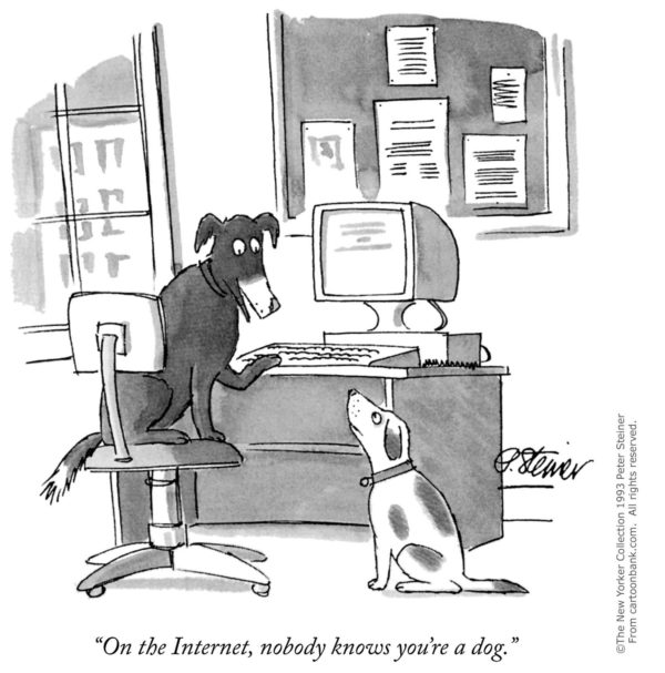
Both kinds of deception are enabled by the ubiquitous anonymity that is the primary affordance of the internet we’ve built. As the venerable cartoon had it as far back as 1989, “on the internet, nobody knows you’re a dog” (Wikipedia). Today, it’s but a moment’s work to gain anonymity such that will defeat even sophisticated inspection.
Graphical Deception
In the literature of graphical display, scholars have developed a catalogue of techniques, including improper scaling, axis changes, data omissions, and truncation, among others. In one study, John Courtis (1997) examined more than 1,300 data displays contained in the annual reports and found 52% of all graphics to be misleading (p. 278).
Nor are his the only such results. Robyn Raschke and Paul John Steitbart (2008) found “abundant evidence that the annual reports of publicly traded companies contain misleadingly designed graphs” (p. 24). Kostelnick (2007) also identified places when readers must estimate area, volume, shading and depth, as well as when interfered with by visual noise (such as insufficient figure-ground contrast) (p. 475) as additional concerns in data visualization, indicating there is some optical mechanism at work.
Scholars have proposed various ways to measure deceptive graphs, such as Edward Tufte’s (2001) “lie factor” (p. 52), and Steinbart’s “graph discrepancy index” (Paul Mather, Alan Ramsay & Alan Serry, 1996, p. 57), but the chart in Figure 4 would be near the ideal ratio of 1 in either measuring system, since the data’s representation is accurate.

Yet, due to unconventional formatting of the y-axis and unnecessary shading, it completely reverses the conclusion one should draw from the data. Notice how the number of deaths depicted by the y-axis increases as the eye moves down the column.
The concept of chartjunk, a term coined by Tufte (2001), applies to a category of misleading graphics characterized by excessive decoration. For Tufte, chartjunk had three types: “unintentional optic art”, “the grid”, and “the duck.” Tufte wrote of chartjunk it “comes cheaper than the hard work required to produce intriguing numbers and secure evidence” (p. 107).
Although sometimes caused by the designer’s understandable impulse to “enliven the display” (p. 107), chartjunk has real deceptive potential, Tufte noted, as it can be employed to “make the graphic appear more scientific and precise” (p. 107), when “the noise clouds the information flow” (p. 108), or when it “camouflages the profile of the data” (p. 113). He used words like “phony”, “fake” (p. 118) and “false” (p. 121) to characterize it. Even the name itself is highly pejorative.

Figure 5 shows a chart that Tufte would undoubtedly call a duck because “the whole structure is itself decoration” (p. 116). The chimerical creature dominating the visual field is repulsively anthropomorphized, the chart axis shamelessly concave, and the triangular data bars magnify differences by making larger values exponentially more prominent.
Tufte’s pronouncement on chartjunk has finality: it is “bad art and bad data graphics” (p.108) and deserves no place in scientific, technical, and professional communication. As Kostelnick (2007) pointed out, if the “gold standard of data design [is] clarity” (p. 116), of telling the most with the least amount of ink, and implicitly therefore telling the truth with the data, than chartjunk is antithetical to that endeavor.
What these seemingly diverse examples, drawn from different ends of the deceptive spectrum, show us is nevertheless quite particular. Online scamming such as trolling and catfishing have dark patterns that are used in perpetrating interpersonal deception, while deceptive charts also use dark patterns in their design. These examples are not interfaces such as those we will study later, looking at the dark patterns that inform them does allow us to see that all such deceptive communication relies on disguise, on concealment and camouflage, and this proves important to the rhetorical theories of cunning and the gestalt theories of perception we examine next.


